Increase engagement with Xbox Music in the living room
Increase engagement with Xbox Music in the living room
In November 2013 we launched the Xbox One. While the new console presented a lot of exciting opportunities, the v1 version of the Music app on Xbox One was fairly basic. When compared to what had been shipped on the previous generation console, there were a few notable missing features. Music videos was one of them.
The living room was the primary context in which Xbox Music was used at the time. YouTube (partnering with Vevo) was emerging as the most popular free music (and music video) offering. The basic version of the problem statement involved allowing users to find and play music videos in Xbox Music on their new console.
A gaming/entertainment console is connected to the largest screen, and the best speakers in the house. We wanted to take advantage of this and create an engaging experience in the living room with music and music videos that helped increase overall engagement with Xbox Music in the living room.
ROLE : Product Designer | UX Program Manager
FOR : Xbox
DATE : Mar 2014
Accountabilities
Accountabilities
Product design and UX vision for Music Videos on Xbox One
Created UX and UI designs for target set of scenarios. Partnered with a visual designer on the team for final typography, color, and layout choices.
Co-invented the experience, and drove requirements with client and service teams to enable the desired user experience.
Managed the roadmap for the experience
Worked closely with a talented team of engineers to ship the experience on Xbox One
Worked with PR and Marketing teams on launch plan
Audience
Audience
The target audience was Xbox One users that used the console to stream music (via apps like Xbox Music, YouTube, Pandora). This skewed our audience fairly heavily towards gamers.
Some additional context: Xbox Music was a premium subscription streaming service. As a result, the audience included users that were current subscribers, those on our 1 month free trial, and those that hadn’t yet checked out the service on their console.
Constraints
Constraints
The timeline for the project was 4 months. Xbox One had its first major update post launch scheduled for March 2014. Shipping this experience in March with other updates would mean better PR / Marketing at time of launch.
Business deal renegotiations with the music labels were explicitly out of scope in this timeframe. We could leverage existing music videos in our catalog, but those would be streamable only by Xbox Music premium subscribers. This made it difficult to attract new users to the service since they would not be able to play music videos without subscribing or signing up for a trial.
Research Insight #1
Research Insight #1
Lukewarm response to music videos on Xbox 360. Users not interested in curating and managing a collection of music videos
Their collection of songs is already available across devices, and represents a carefully curated set of music they care about
Lukewarm response to music videos on Xbox 360. Users not interested in curating and managing a collection of music videos
Their collection of songs is already available across devices, and represents a carefully curated set of music they care about
Research Insight #2
Research Insight #2
Lot of music videos watched if barrier to consumption is low (success of music videos on YouTube and Vevo)
Search, discovery, and recommendation of content is key
Lot of music videos watched if barrier to consumption is low (success of music videos on YouTube and Vevo)
Search, discovery, and recommendation of content is key
Approach
Approach
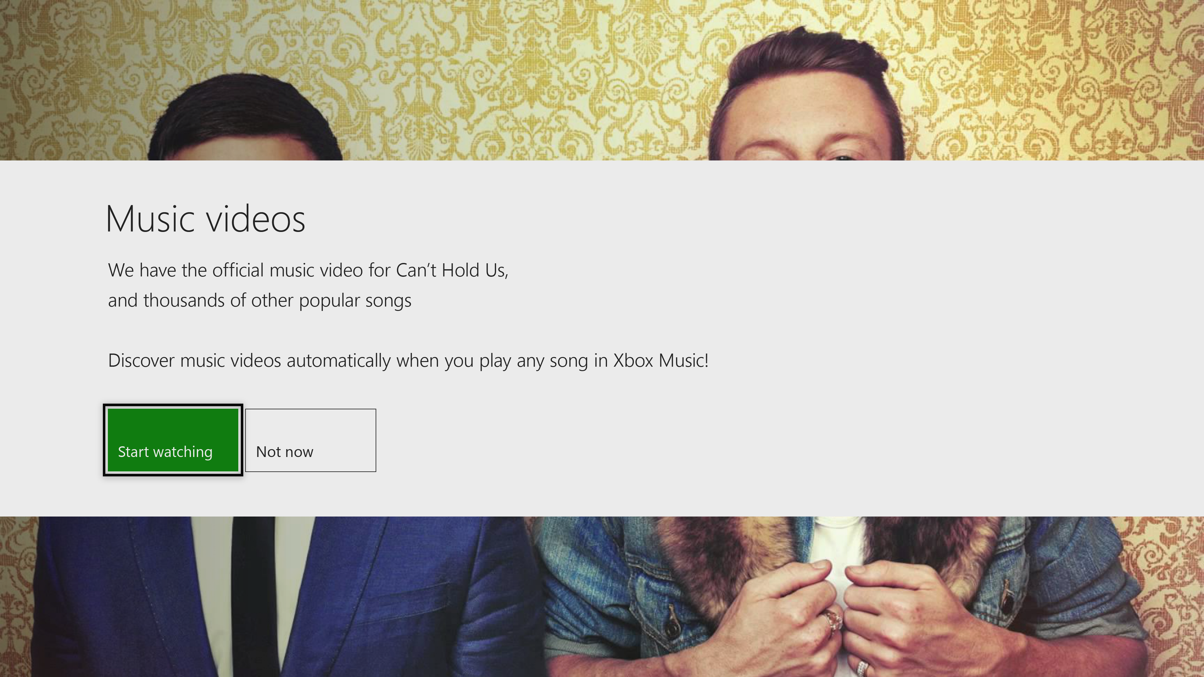
Our approach was to blur the line between music videos and songs, and remove any additional work on the part of the user to go discover music videos. Music videos automatically play on the TV when the user plays a song that happens to have a music video. The early UX flows highlighted this hero scenario. Feedback from users was very positive. The easter egg style discovery of music videos was an immediate delighter. Additionally, this could help enable discovery of music videos for songs from a user’s existing music collection or playlists.
Encouraged by the preliminary feedback, we created a list of v1 scenarios (below):
- I’m able to automatically consume music videos instead of tracks when Xbox Music has a music video available
- I’m able to browse new music video releases from the Xbox Music catalog
- I have clear indication that a music video is available for a track, and that the music video will played in-place of the track
- I’m able to continue to have a seamless cross-screen experience with my music collection regardless of whether the device supports music videos or not.
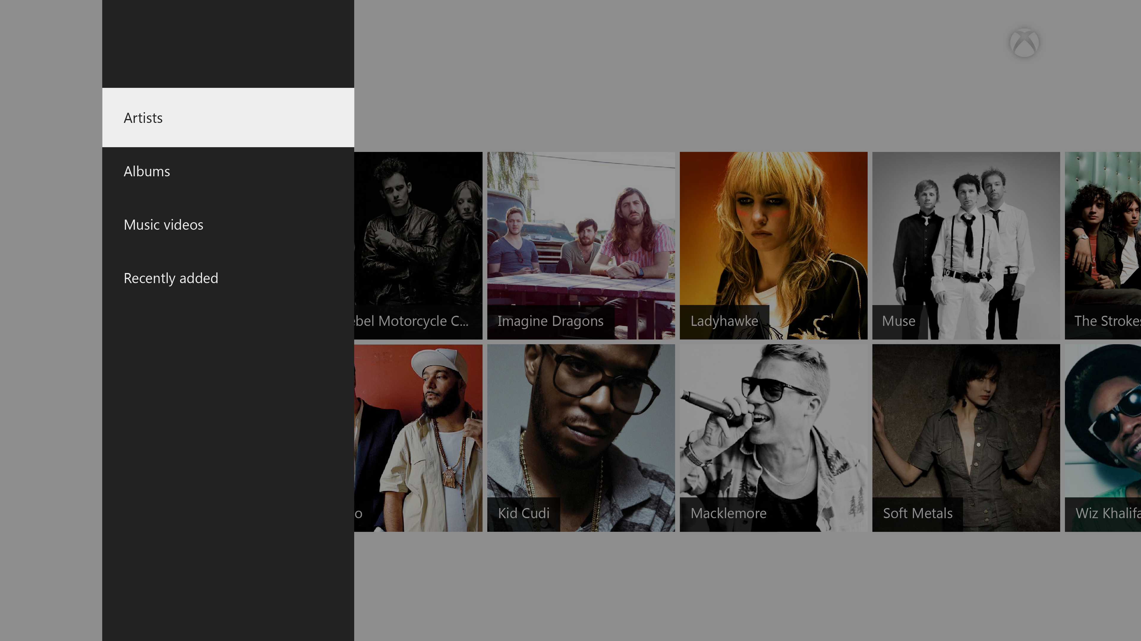
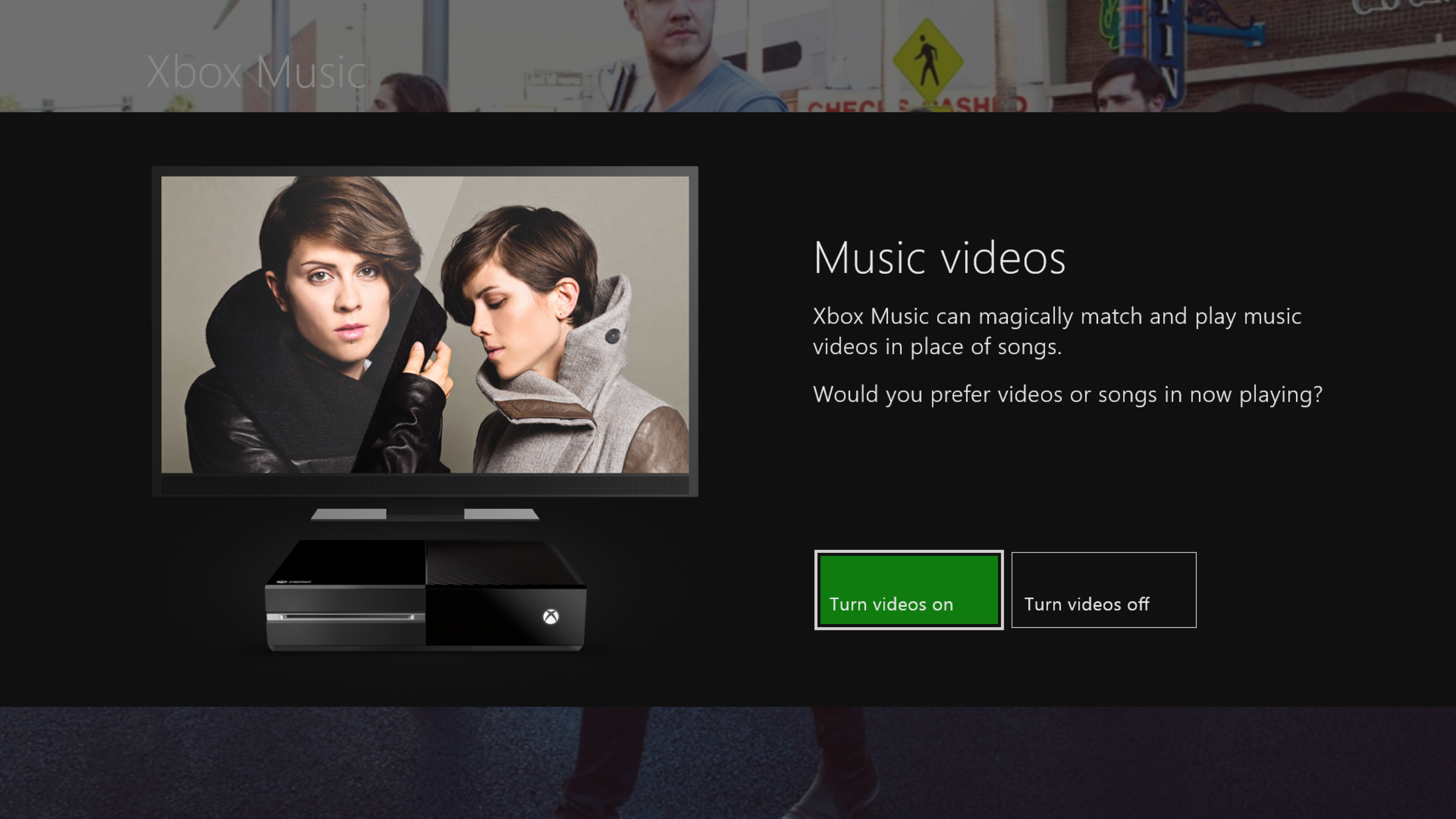
- I’m in control of my music video experience: I can turn on/off music video mode
- I’m able to discover an artist’s music videos from their details page
- I’m able to search for music videos from the catalog.
- I continue to have a smooth experience with music videos when entering/exiting now playing, and snapping/unsnapping the music app
I then worked on UX flows for the above scenarios. The flows were fleshed out in close partnership with engineers on the client and service teams (to make sure technical constraints were being discovered and considered real time). UX and UI specs were created for each of the above scenarios along with clearly articulated acceptance criteria. During development, we continued to refine the designs based on stakeholder and user feedback. Final adjustments to layout, typography, and color choices were also made at this time (in partnership with a visual designer on the team).
Early feedback exposed some rough edges and unique challenges that we had to think through before broader rollout. For example: handling of live/remix versions of songs, parental controls, playback experience for snapped and background audio etc. After a lot of refinement, we landed on the below experience.
Early iterations
Early iterations
Music video galleries
Music video galleries
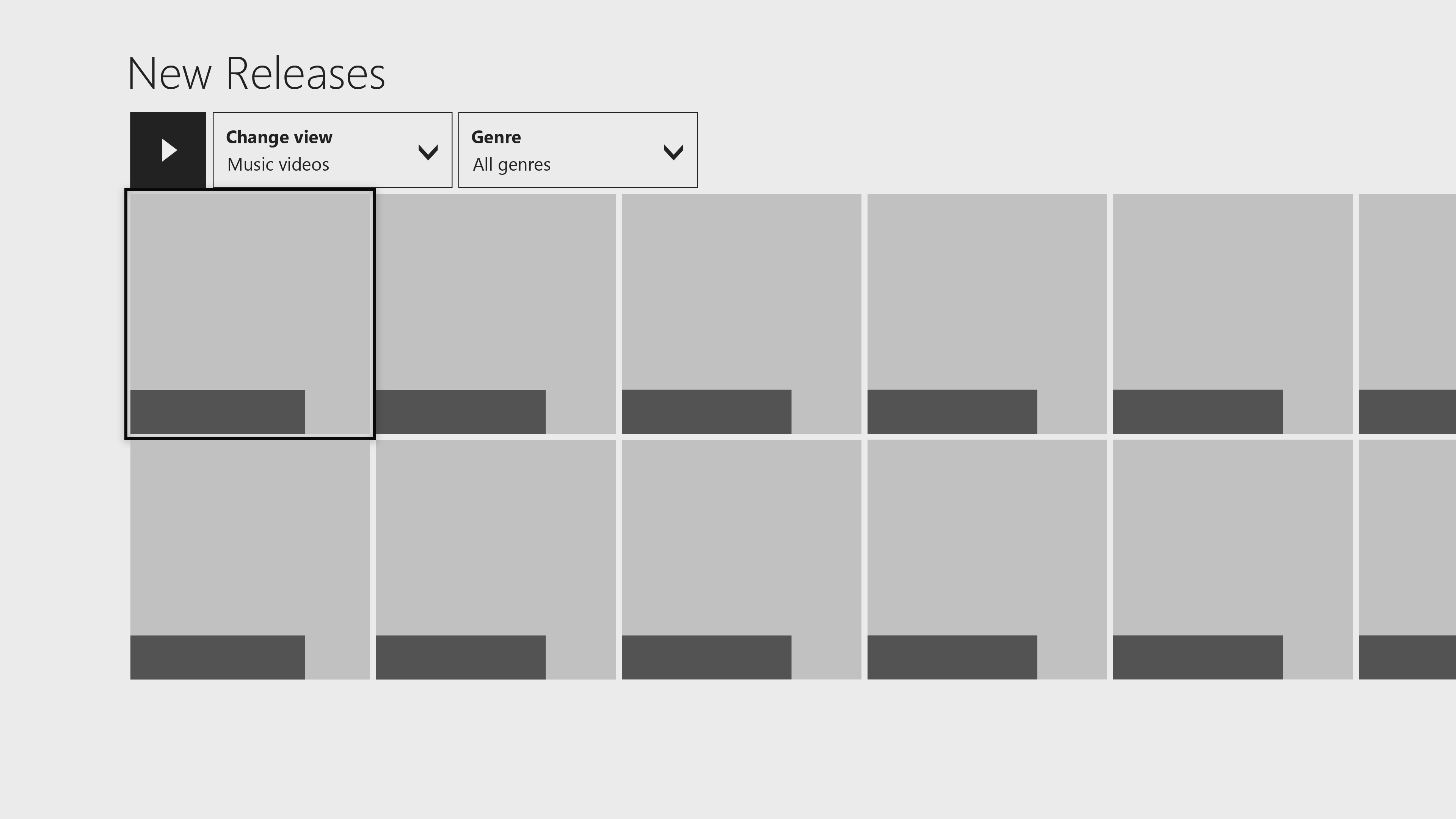
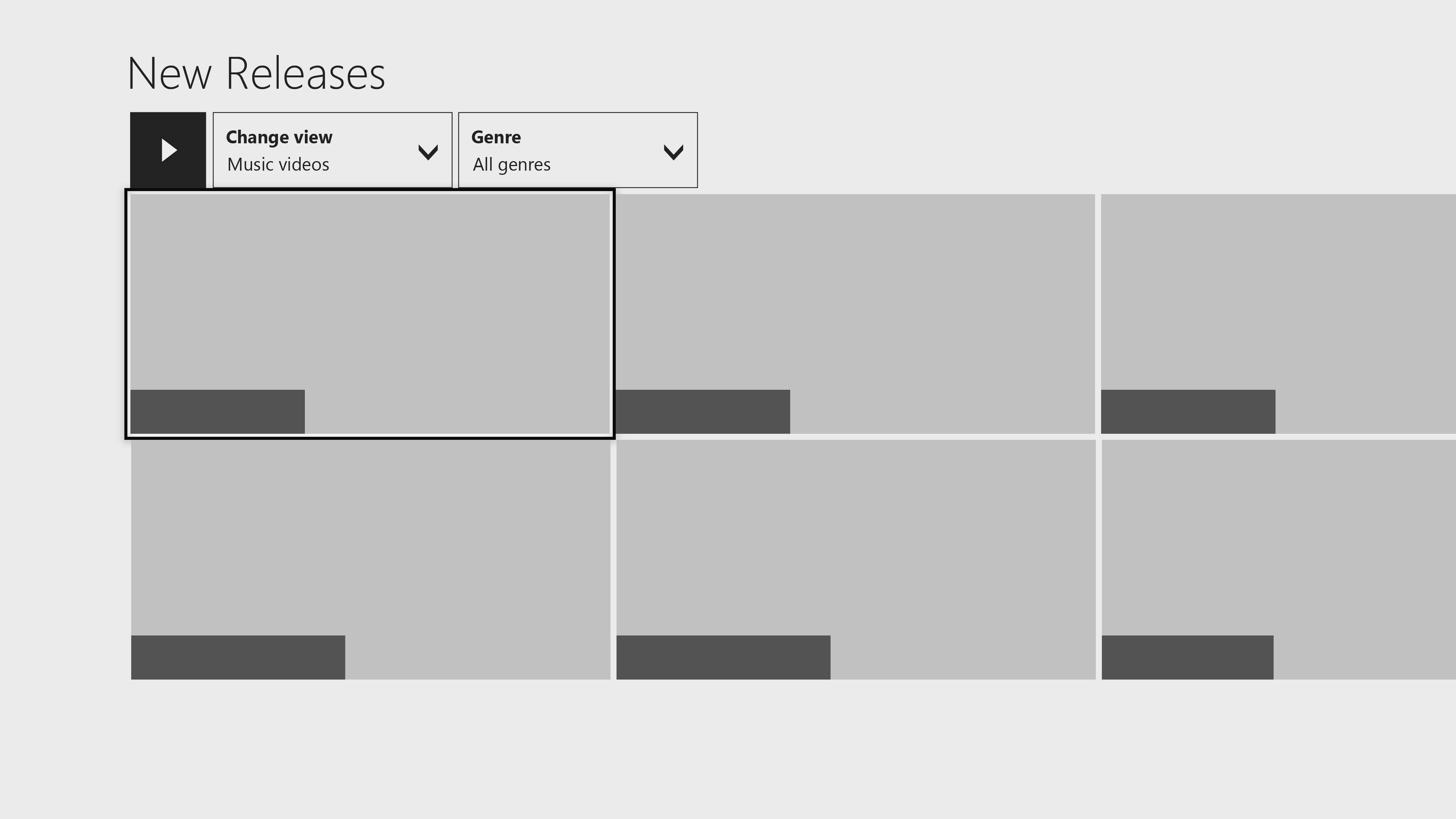
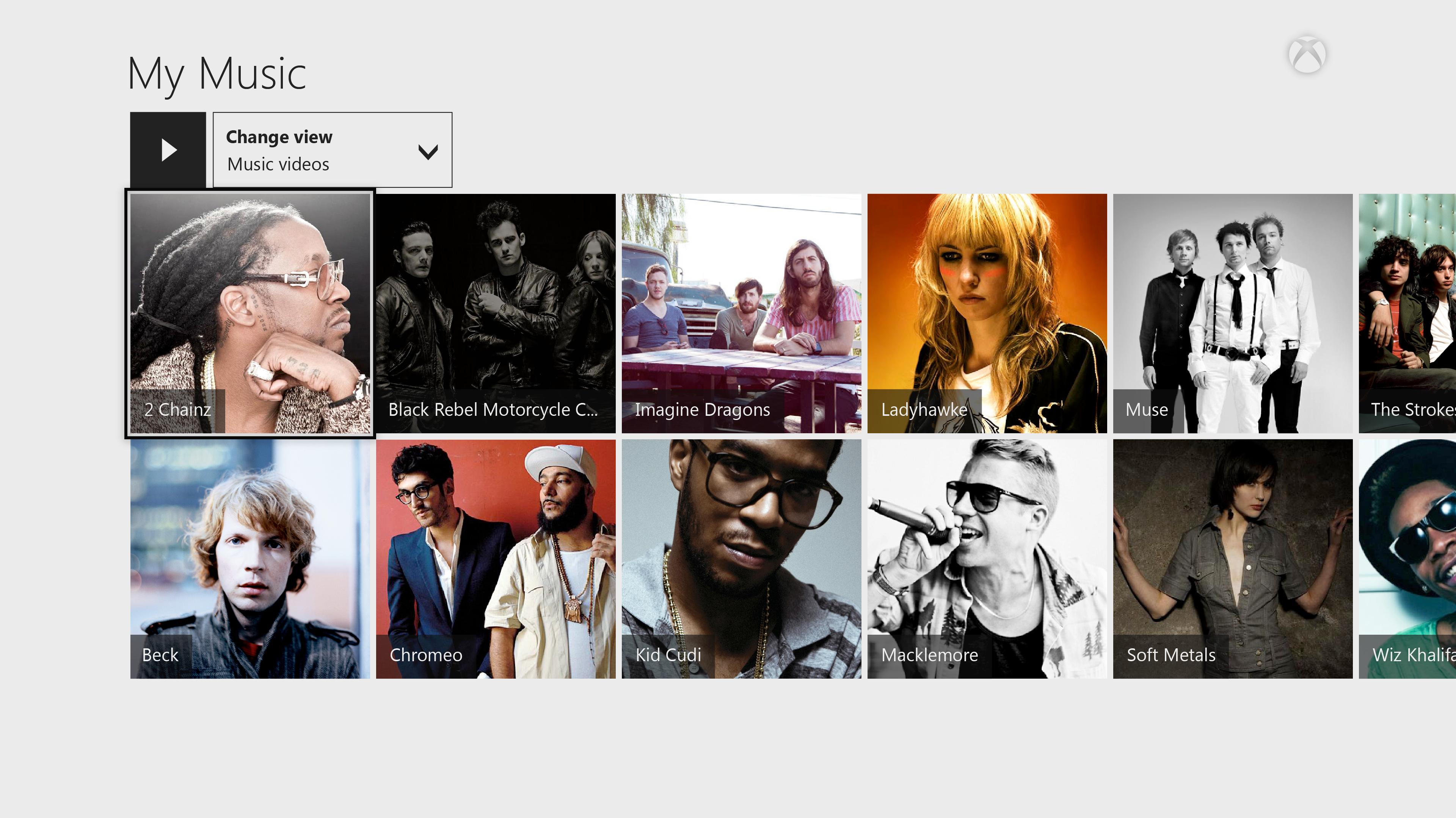
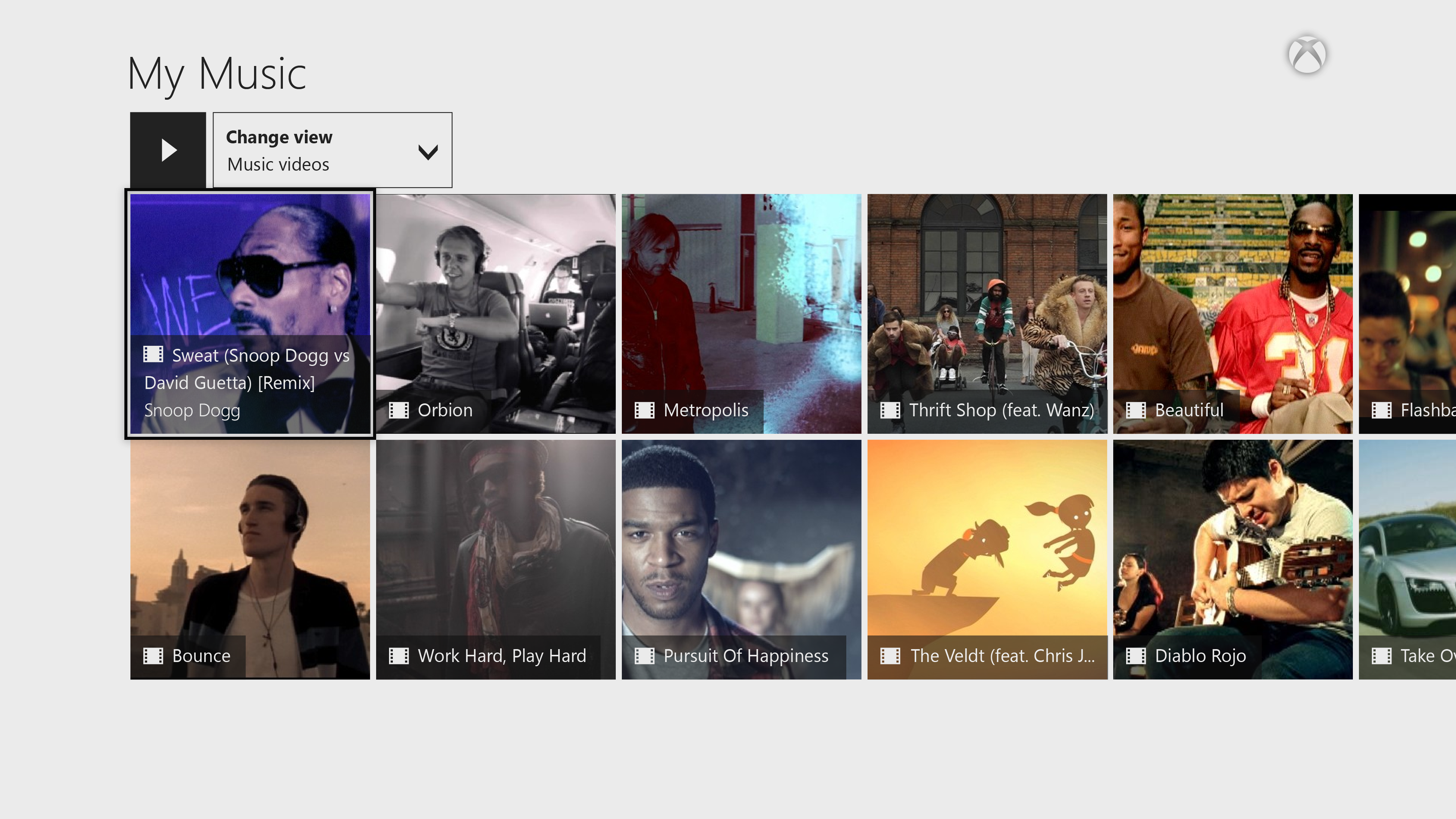
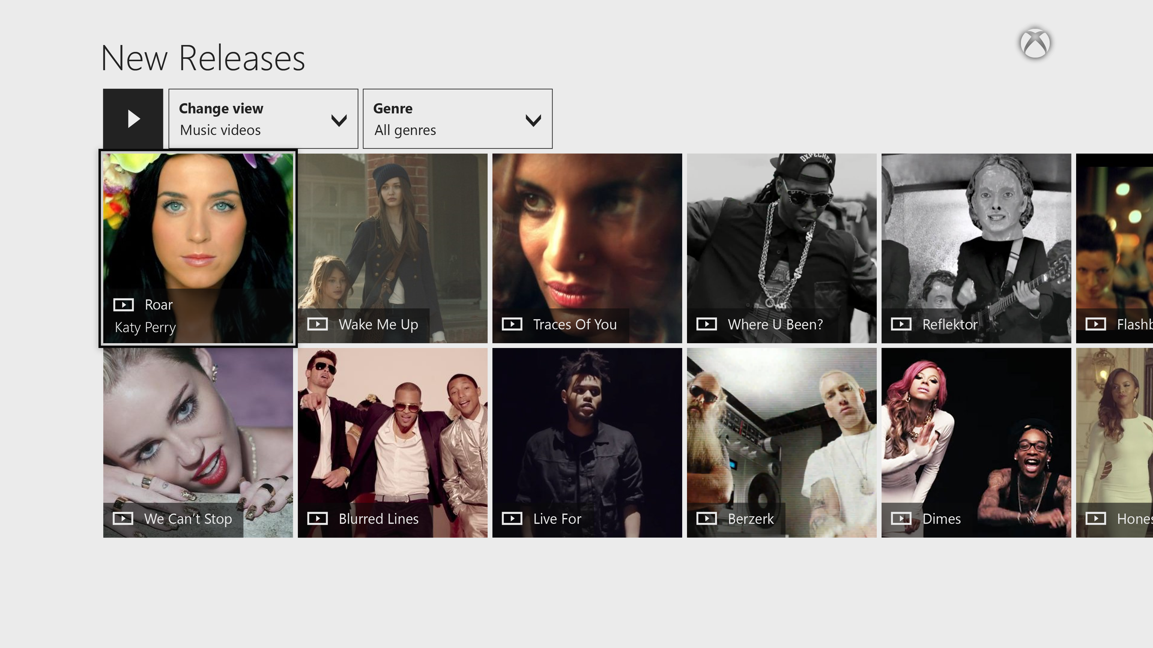
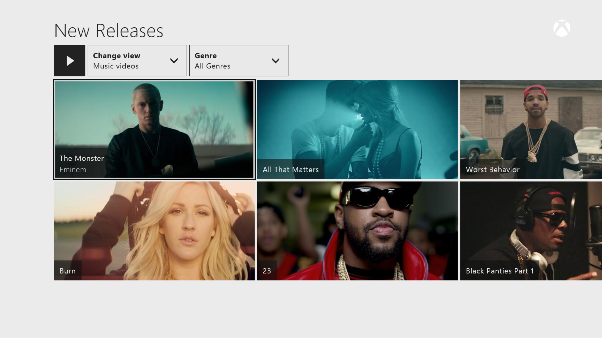
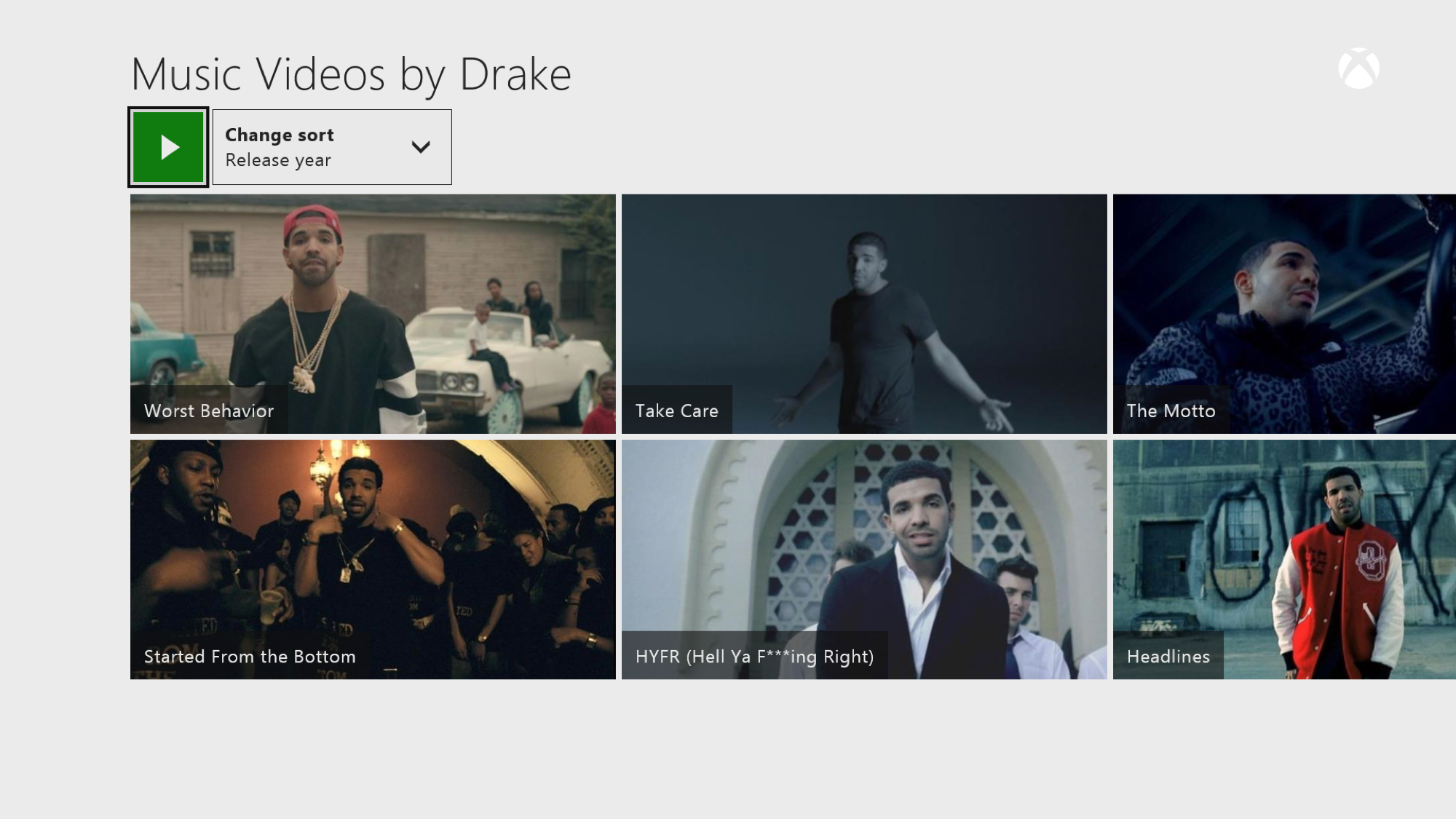
Music videos were initially represented by square tiles in gallery views (albums and artists both utilized square tiles). This meant that we had to badge tiles to communicate that the item is a music video. Additionally, it was difficult to distinguish between albums and music videos in mixed galleries (like search results, and on the dashboard). To more clearly communicate this difference, we chose a wide tile design for videos, and stuck to existing square art for albums and artists.
Now playing experience
Now playing experience
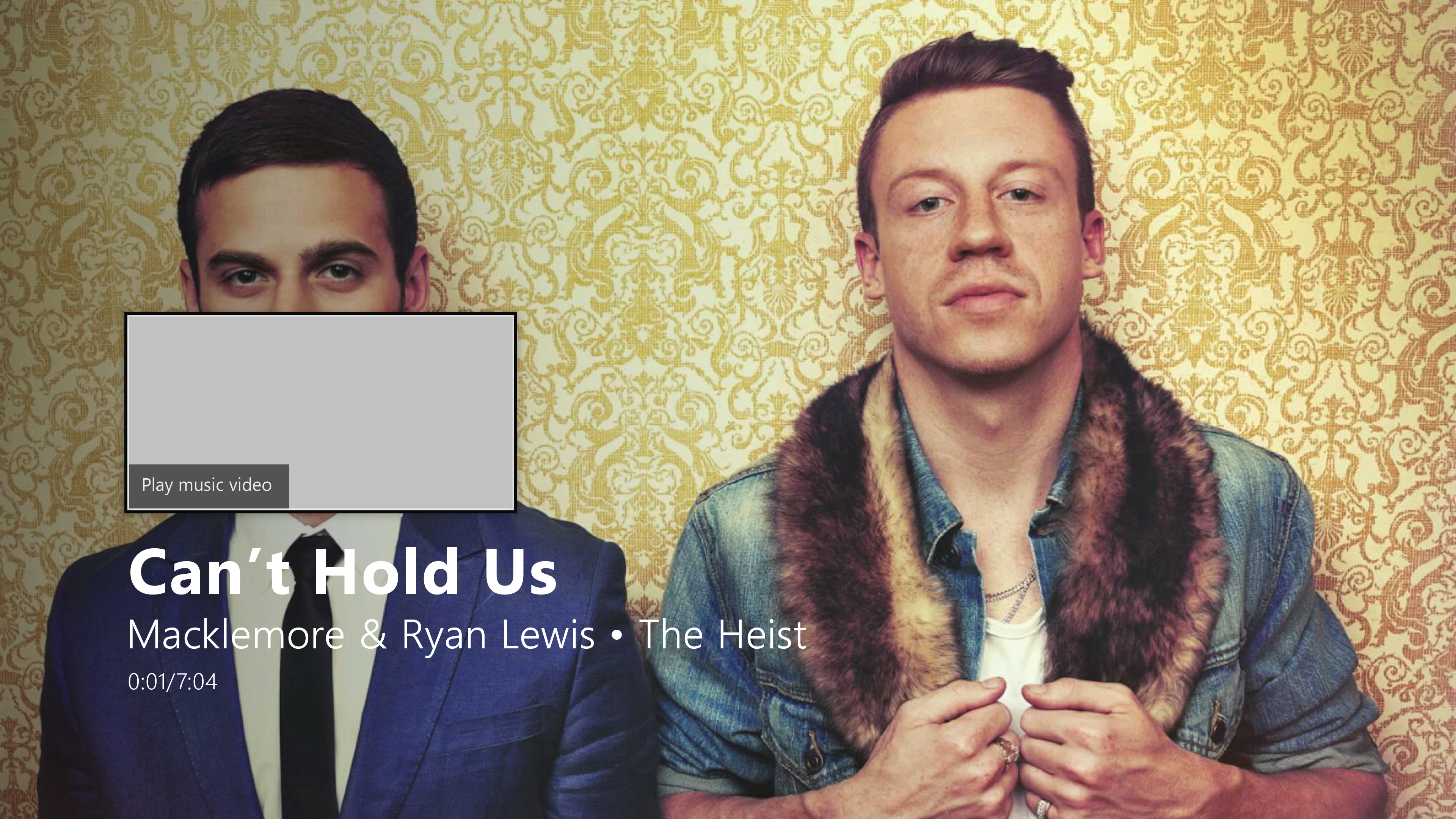
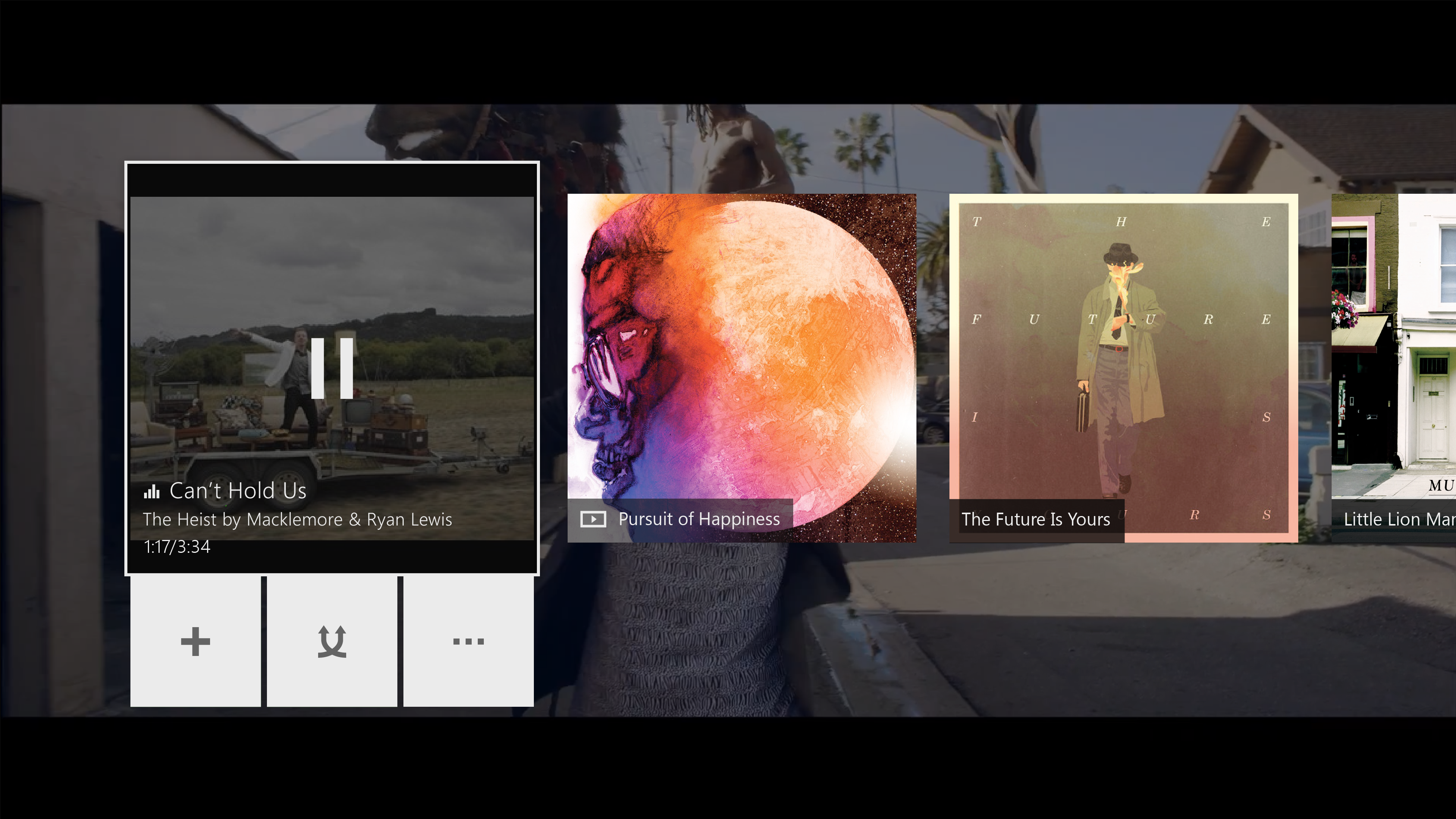
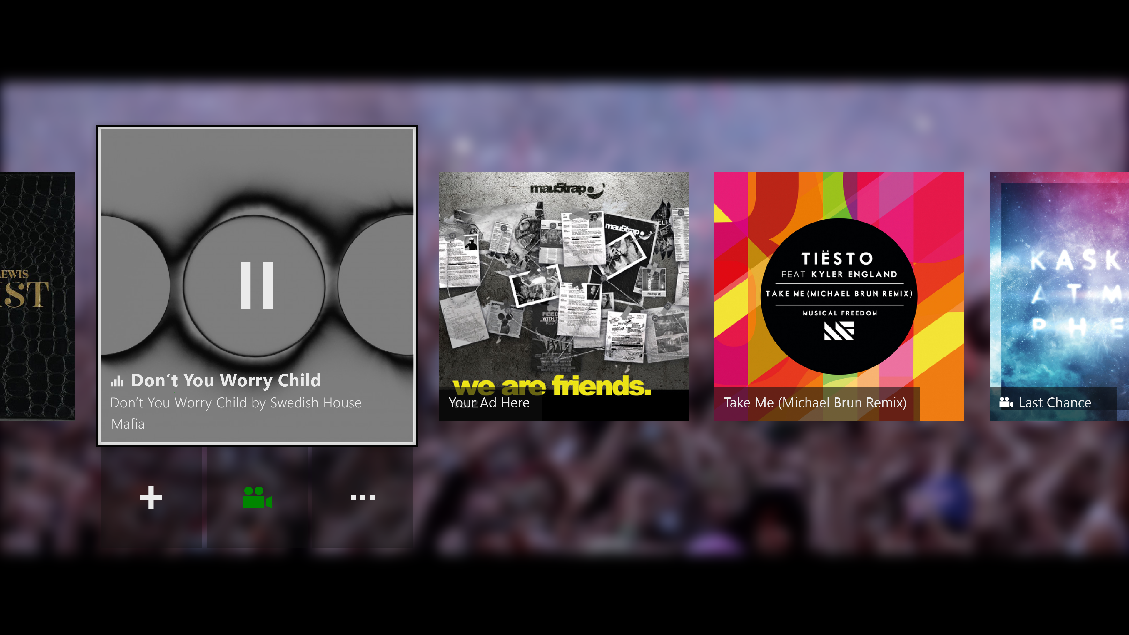
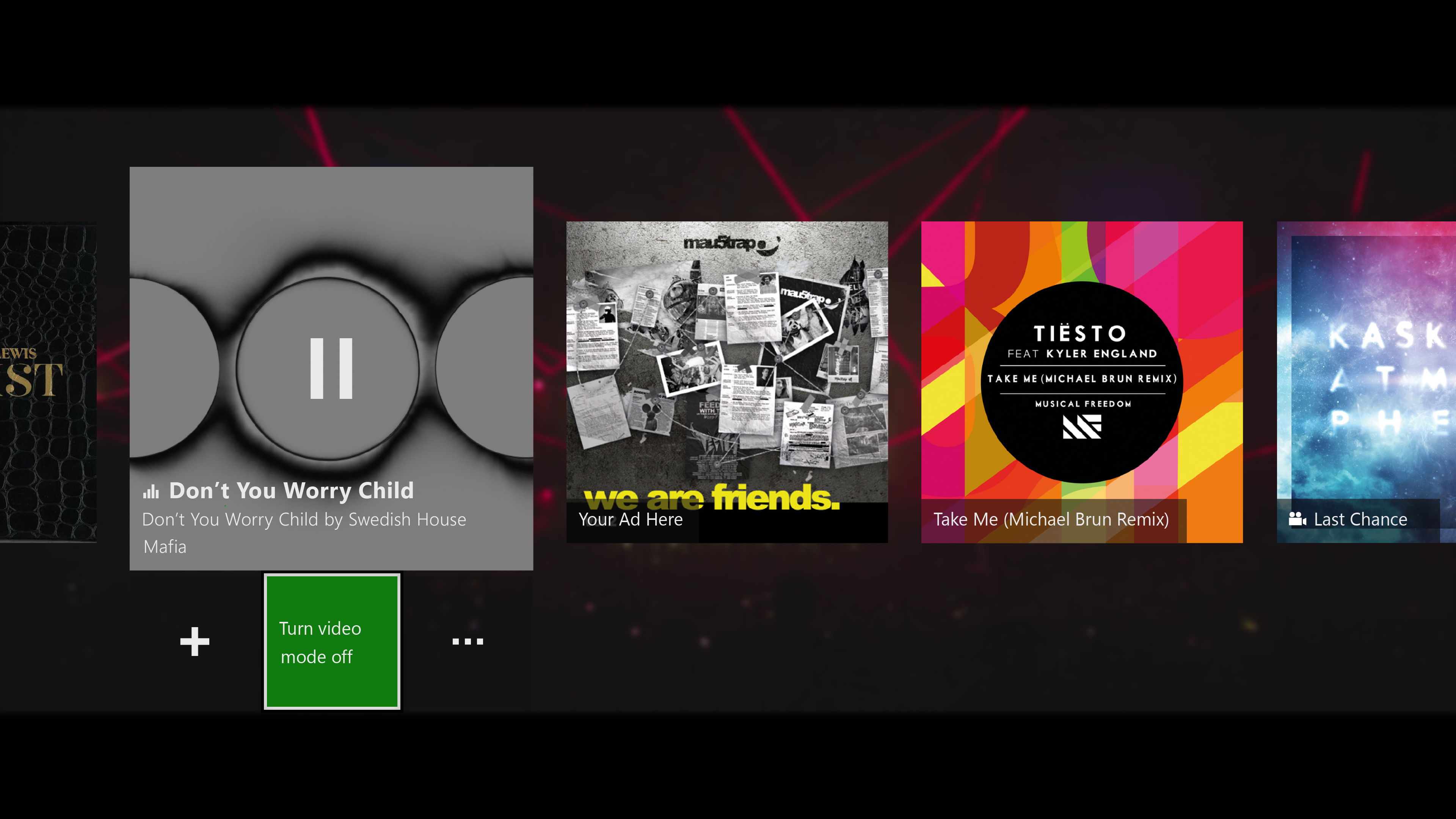
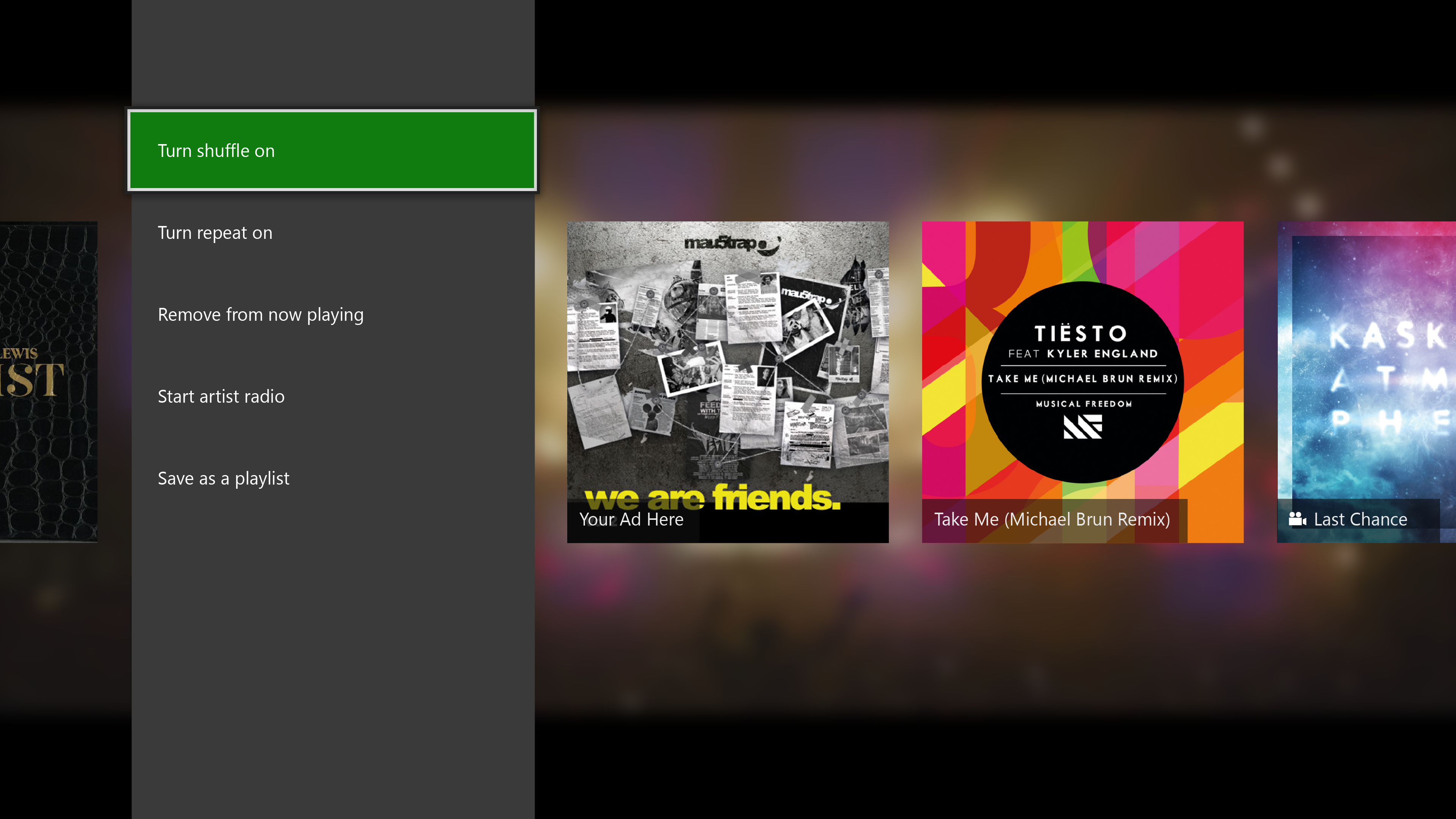
A technical constraint prevented us from varying the tile width in the now playing experience based on whether the item was a video or a song. Earlier explorations looked at showing the video thumbnail letterboxed in a square tile. This didn’t provide great results visually. Our final design showed album art, and used badging to denote videos in the now playing list. The entry point to turn off video mode was located in the overflow menu, and wasn’t easily discoverable). This option was later added to the top level based on feedback (and we moved the shuffle command to the overflow menu based on relatively low usage on the console).
Final Designs
Final Designs
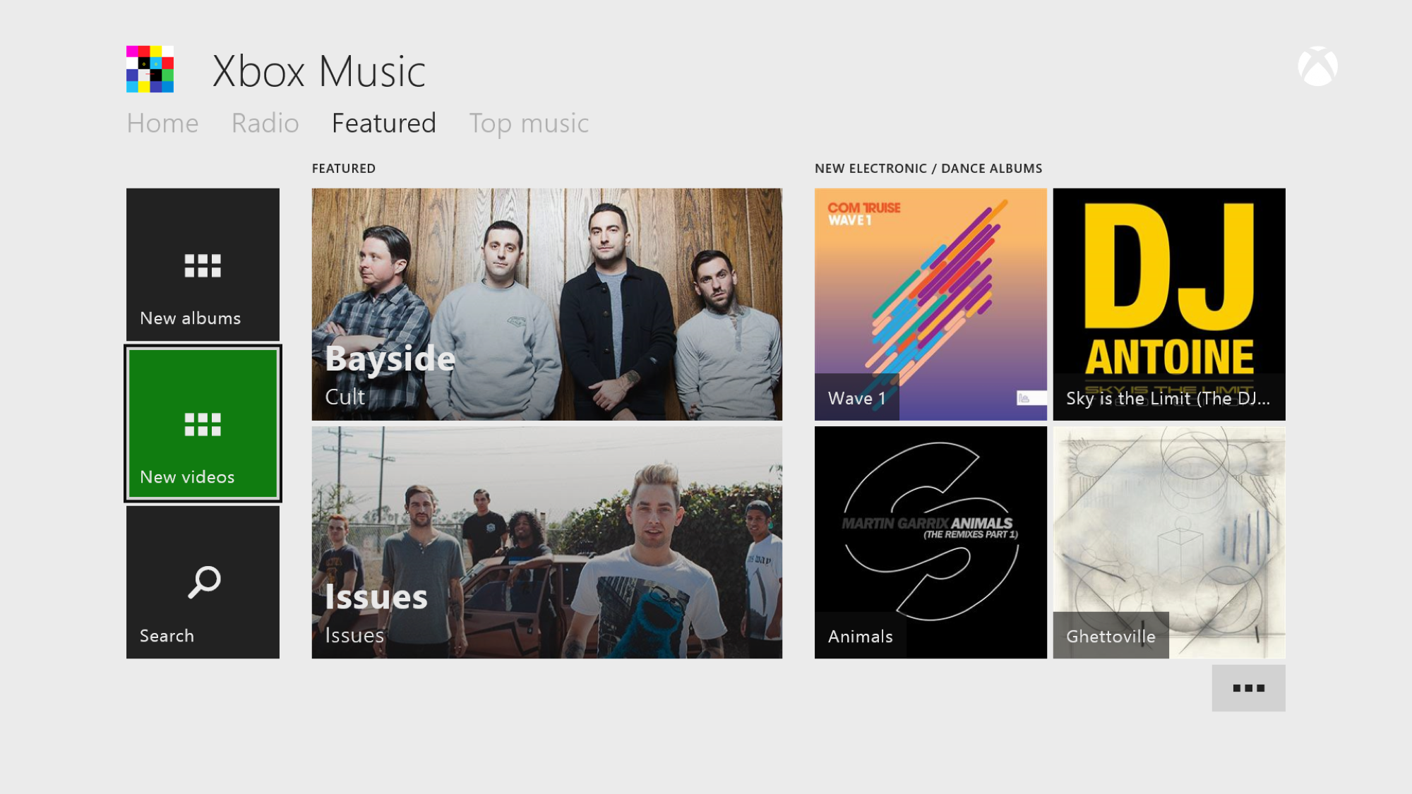
Music videos are accessible from the Xbox and app dashboard. This includes a featured music video gallery for new releases.
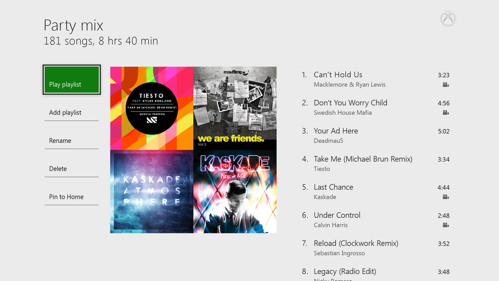
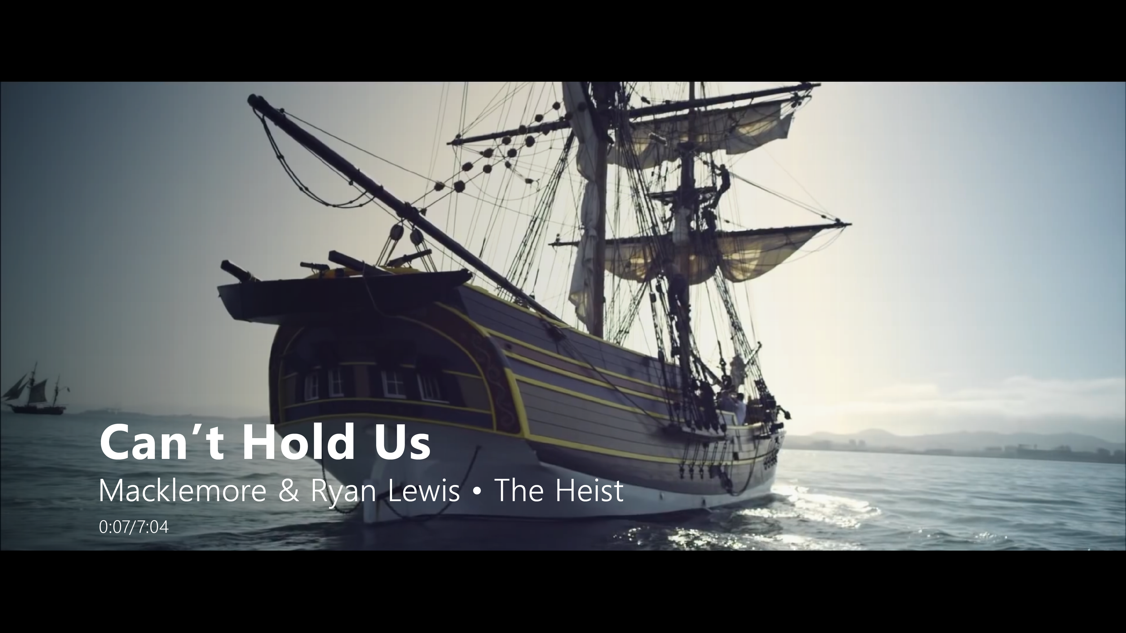
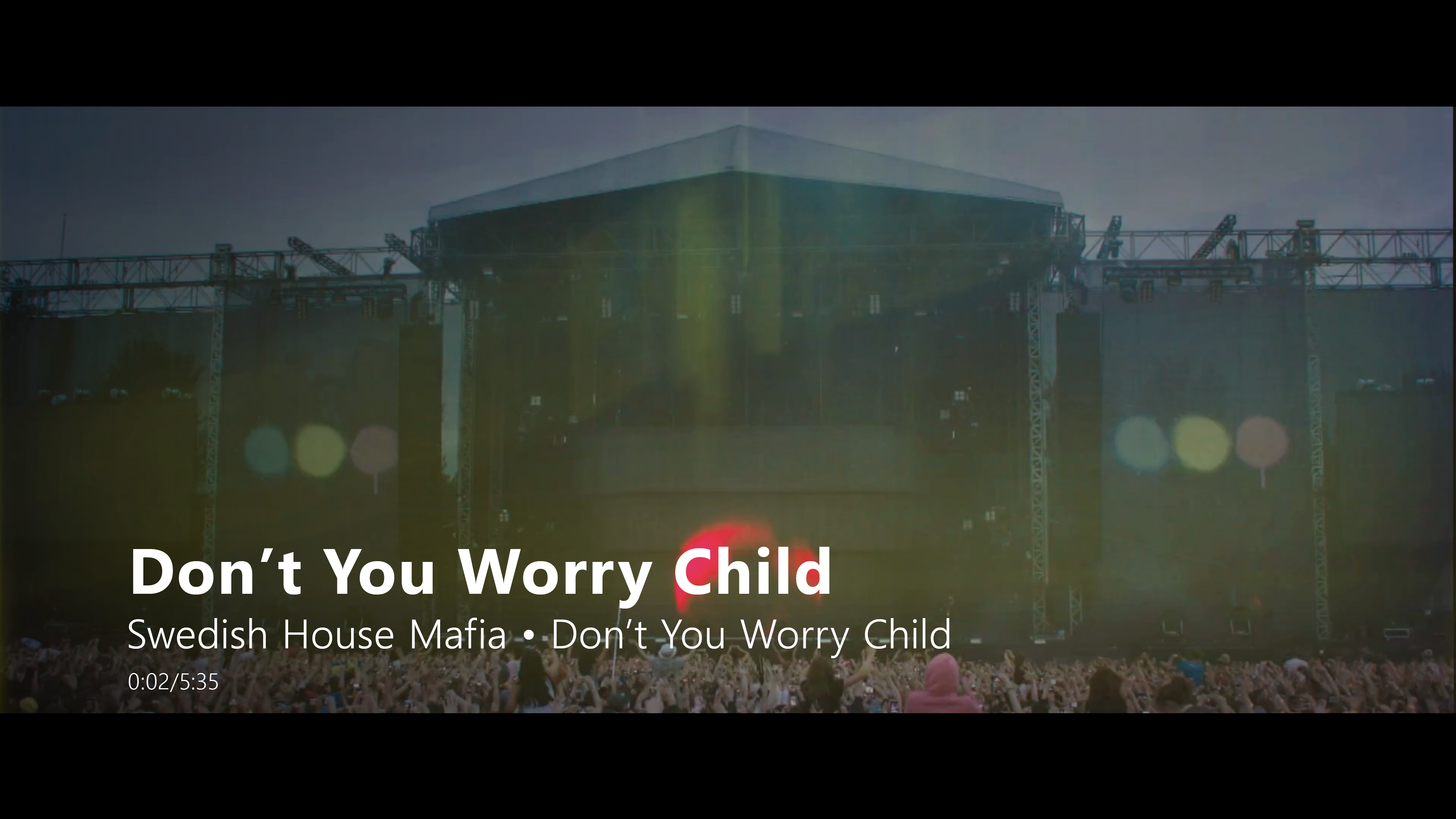
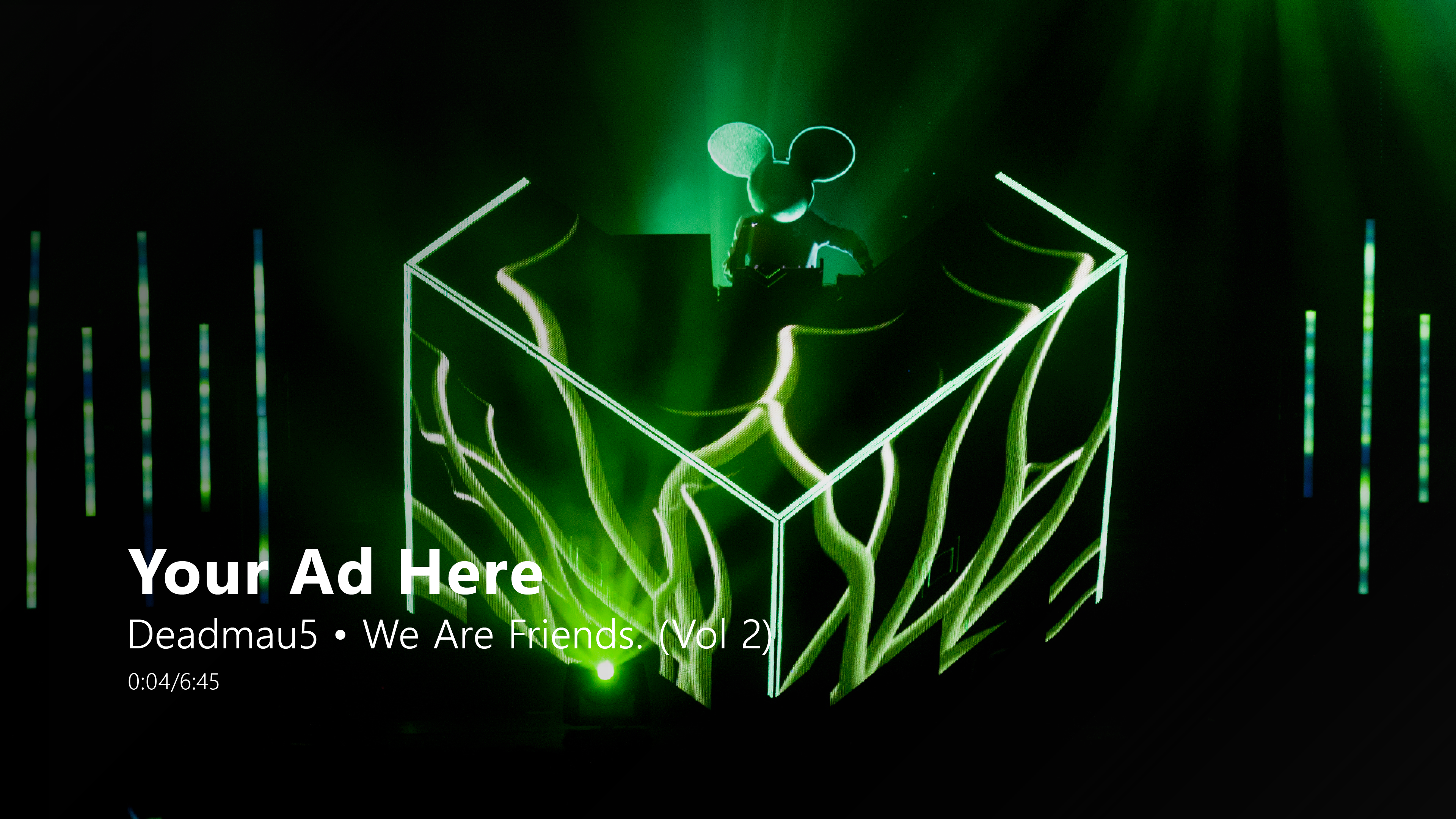
Music videos are automatically played instead of songs (when a music video is available). This is an opt-in experience for users, and the video icon is shown beside all tracks that have a music video
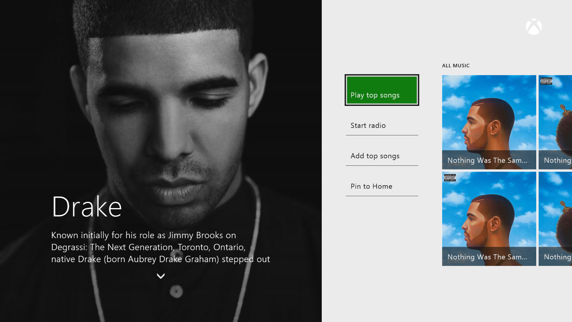
The consumption experience seamlessly switches between music videos and audio tracks. The artist details page allows the user to discover and play all music videos from the artist.


Success metrics
Success metrics
Increased engagement with Music on Xbox One (daily active users and monthly active users)
Increased playback of Music Videos
Low opt out rate for auto-music videos experience
Positive PR and news coverage on launch
Increased satisfaction with Music on Xbox One
Outcome
Outcome
Shipped on Xbox One. Increased engagement with music on Xbox One with existing Xbox Music subscribers. Observed usage in the weeks after launch:
- Music consumption on Xbox One started to match the consumption on Xbox 360 (despite Xbox One only having a fraction of Xbox 360’s user base at the time).
- 45% more consumption of music videos on Xbox One than Xbox 360.
- Plays of music videos were close to ~20% of all music consumption on Xbox One.
Positive user feedback and PR on launch. PR quotes below:
“With the app, Microsoft has removed the divide between songs and music videos.” – Dante D’Orazio, The Verge
“Vevo, a joint venture between venture between Sony Music Entertainment and Universal Music Group with a strategic investment by Google, has quickly become the go-to source for music videos, and has grown significantly in the last year partly because of its effort to get on more televisions. But Xbox One has been a holdout. This might explain why.” – Joan Solsman, CNET
“Xbox Music fan? Your experience is about to get better now that Microsoft has launched over 92,000 music videos for your viewing, and of course listening pleasure.” – Lily Prasuethsut, TechRadar
Lessons learned
Lessons learned
Not pushing the envelope on what content was available outside the subscription paywall limited the scope/success of this project. In hindsight, the team should have spent more time and energy experimenting with new business models with music videos on the console. That could have helped improve our chances at attracting new users with this differentiated experience.
A simplified experience results in more usage- this was a pretty obvious lesson learned after comparing usage/feedback and experiences on Xbox One and 360
Believing in the vision for a product/feature motivates team members to go the extra mile to deliver the best possible experience for users. I’m proud of how the team came together to ship this experience in a relatively short period of time.